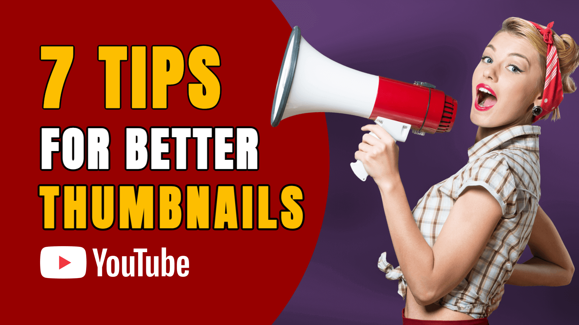
Let’s face it - your thumbnail can make or break your video’s success on YouTube.
Before your content even gets a chance to shine, viewers decide (in a split second) whether or not they’ll click — and your thumbnail plays the most significant role in that decision.
Think of it like this: a great thumbnail isn’t just decoration. It’s your video’s billboard. And with millions of videos competing for attention, you must stop the scroll and shout, “Click me!”
Ready to level up your thumbnail game? Here are 7 proven design strategies to help you stand out, get more clicks, and grow your YouTube channel faster.
1. Use High-Quality, Emotion-Packed Images
Blurry screenshots or overused stock images just won’t cut it. A great thumbnail instantly communicates emotion or intrigue.
What works best:
- Clear, high-resolution images
- Close-ups of faces showing strong emotion (shock, happiness, curiosity)
- Direct eye contact with the viewer
Facial expressions are a powerful scroll-stopper — use them to your advantage.
Pro Tip: Zoom in on your face or subject, and make sure it’s well-lit and sharp.
2. Use Bold, Readable Text — Even at a Small Size
Most people view thumbnails on their phones, where the image is tiny. That’s why your text needs to be bold, big, and instantly readable.
Best practices:
- Use thick, sans-serif fonts.
- Keep it under 4 words (short = strong).
- Add a solid background or outline to make the text pop against the image.
The text should support the title — but not repeat it. Think of it as the punchline that grabs attention.
Try This: Pair your thumbnail text with the emotion in the image. If your face shows surprise, use words like “What?!” or “Can’t Believe This.”
3. Use Contrasting Colors to Stand Out
YouTube is a sea of red, white, and muted tones. To stand out, use bold, contrasting colors in your design.
Think bright yellows, blues, greens, or even neons — just enough to draw attention without being overwhelming.
Color tips:
- Use complementary colors (blue + orange, red + green).
- Add a background color or shape behind your subject or text.
- Avoid dull, grayish tones — they fade into the feed.
Design Tip: Test your thumbnail in both light and dark mode to ensure it pops in all views.
4. Create Curiosity with Visual Storytelling
The best thumbnails ask a question without asking it.
You don’t have to spell everything out. Instead, hint at what’s inside the video. Give viewers just enough intrigue to make them want to click.
Examples:
- A face with a shocked expression + “This Changed Everything”
- A mysterious object blurred or half-shown
- Before-and-after style split images
Hook Tip: Think of your thumbnail like a movie trailer. Tease, don’t tell.
5. Follow the Rule of Thirds for Better Composition
Great thumbnails aren’t just about what’s in them — but how they’re arranged.
Use the rule of thirds to create balance and visual interest. This classic design principle divides the frame into a 3x3 grid. Placing your subject or text along these lines makes the thumbnail feel more professional and naturally engaging.
How to do it:
- Position faces or focal points slightly off-center.
- Place text in an empty “third” to balance the image
- Leave breathing space so nothing feels cramped.
Quick Test: Step back and squint. Does your thumbnail still look clear and balanced? If yes, you’re on the right track.
6. Stay Consistent with Style & Branding
Consistency builds recognition. If your audience can instantly tell it’s your video from the thumbnail alone — you’re winning.
Ways to stay consistent:
- Use the same font family and colors across all thumbnails.
- Keep your layout style (text position, subject size) similar.
- Add subtle branding — like a logo or watermark — without overcrowding.
The more consistent your visuals are, the more bingeable your channel becomes.
Pro Branding Tip: Create a thumbnail template you can tweak for every video, saving time and maintaining a clean, pro look.
7. Test, Tweak, and Analyze
Even seasoned creators don’t always get it right the first time. That’s why it’s important to track how your thumbnails perform and be willing to experiment.
Look at:
- Click-through rate (CTR): Are people clicking when they see your video?
- Watch time: Do viewers stay after clicking, or bounce quickly?
- A/B testing: Try different thumbnail versions over time and compare performance
Small tweaks — like changing one word of text, brightening an image, or shifting your subject — can dramatically improve results.
Growth Tip: Don’t delete underperforming videos. Try updating the thumbnail and title to revive them.
Recap: 7 Steps to a Scroll-Stopping YouTube Thumbnail
Here’s your cheat sheet:
- Use clear, emotional imagery.
- Add bold, readable text.
- Use color contrast to stand out.
- Create curiosity visually
- Apply the rule of thirds.
- Keep your style consistent.
- Track performance and tweak over time
Final Thoughts: Your Thumbnail is Your First Impression — Make it Count
YouTube is more competitive than ever — but smart design gives you an edge. Great content deserves great packaging, and your thumbnail is that packaging.
By applying these 7 pro tips, you’ll give your videos the best chance to succeed — before anyone even hits play.
So go ahead — create that attention-grabbing thumbnail. Because clicks aren’t random. They’re designed.